Logos
As a collective, the team all decided to draw a logo each on a piece of paper. The logos were so contrasting that the collective could not decide on a specific logo that had been suggested by one of the members. In that case, it was taken upon the editor to combine all of the ideas into 3 different logos that could then be analysed and evaluated. The 3 different logos that have been shortlisted have been explained and critically analysed in order to form a justified result.
As a collective, the team all decided to draw a logo each on a piece of paper. The logos were so contrasting that the collective could not decide on a specific logo that had been suggested by one of the members. In that case, it was taken upon the editor to combine all of the ideas into 3 different logos that could then be analysed and evaluated. The 3 different logos that have been shortlisted have been explained and critically analysed in order to form a justified result.
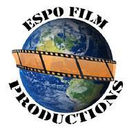
One positive aspect of this logo was that it was easy to create and anything that was difficult to do, could be resolved by online help guides – all of the images/text could be inserted and edited simply. This is a positive aspect because it was not rushed and not a lot of time was spent creating it. This meant that more time could be focussed on filming/editing etc. Also, the logo also includes all of the relevant information needed in a logo. This is useful to other companies because they are not mislead by any information that has been given by the logo. It is also appropriate for the target audience (film lovers) as they will not get mixed messages about what the company does – also it does not specify a certain film genre so the company is not focussing on one specific genre. This is a positive aspect because the company does not have to worry about straying out of the subjective genre that was identified in the logo. Another positive aspect of this logo is that it gives off the impression, by featuring the image of the earth, that it produces successful films that go worldwide. This is a positive aspect of the logo as it will attract high-rated actors/actresses to star in the productions. From this, the company will then significantly increase the profits and the company then gains a higher budget for the next production.
Although, one consequence of this logo was that it is simplistic – meaning that the photoshop skills were not challenged and pushed to the full potential. However, this can be resolved in the future by creating a more complex image and using help guides for assistance if necessary. Another consequence of this logo was that the conversion from still image to movement will not be easy. This is because the orange film overlapping feature has been created using two separate images combined. Despite this, it can be resolved by watching help guides and using peer advice if necessary. Additionally, another consequence of this logo is that it took such little time. This means that the logo is at risk of not looking professional. Because of this, the logo may not reach its full potential and will certainly risk the company investments from large scale businesses and agencies. However, this can be overcame by making any necessary improvements after the film-making and editing process has been conducted – so that no more time is spent on adjustments than is absolutely necessary. Also, the name connotes that films are produce and this limits what the company produces. This can be amended by altering the name.
Logo 2:
Despite this, the consequences of this logo is that the colour scheme is very basic. This is a largely impacting consequence because the company is then giving off the impression of being very creatively limited. As a result of this, the large scale businesses would be deterred from the company – when looking for new roles for their most successful actors to feature. Another high consequence of this logo is that the film strip boarder has connotations of being strictly focussed on film. This is a very high consequence to make because the investor could be mislead by this – thinking that the company only concentrates on filming the actors (no marketing etc.) However, this can be resolved by changing the name to an alternative that does not eliminate the possibilities of the company. In similarity, another consequence (that is quite pressing) is that the logo does not show off the editing skills of the team members. This would then deter the large scale businesses from investment because the company logo gives of an ameture 'vibe.' However, this can be resolved by using help guides and other online guides to assist the editors with the imagery and media.
Logo 3:
One positive aspect of this logo is that it was not difficult to figure out how to animate it. This then meant that more time was spent animating the logo as opposed to trying to agree on how the image was to be animated. This is a positive aspect because it then meant that the group was not at a dispute of how the logo was to be animated. This improved teamwork skills and significantly improved time management. Because of this, the work is then able to be distributed evenly and the members are able to select tasks that suit their strengths. Even if a task is already taken up, that team member is then able to improve their ability of a certain task, or even assist the other team members if there is no tasks left. Another positive to this logo is that it was not time consuming to create. This positive then meant that more time could be spent analysing the logos and evaluating the positives and negatives. This time constraint then meant that the project was then pushed to get done on time – along with the overall project. Additionally, another positive attribution of this logo is that the images that were used all correlate to the subject audience – being large scale production businesses and the TV audience. This is a positive aspect as the audience/business will not get “thrown-off” with the logo as it connotes the purpose of the company in the images used. In addition to the last point made, the logo does not strictly outline the genres of film that the company will produce. This allows the company to boost income and publicity as they can experiment with the genres that they use. Also, high scale agencies will be attracted to the company as they are more “risky” and experimental with their film casting.
Although, the main consequences of this logo is that the colour scheme is very basic. This is a consequence because the team-members in control of the editing cannot be as creative with the animation as the colour scheme is very dull. However, this can be resolved by recreating the logo with more creative colours. Another consequence of this logo is that the large scale film companies will be put off investing and working with the company because the logo sets the impression that they lack creativity. This is a largely impacting consequence as the film makers cannot become successful and “well known” if no headlining stars are featured in the production. Additionally, another consequence of this logo is that the logo was not a feature of the project that had a lot of time spent on it. This is a large consequence because it always carries the risk of being rushed or incomplete. If this was the case, large scale film producers would not likely invest in the production as the logo gives off an amateur approach to film making. This would mean that the company would not become as successful as possible, as the production would not contain any “headlining stars.” Also, the name connotes that films are produce and this limits what the company produces. This can be amended by altering the name.
Chosen Logo
Logo 1 has been selected because it was easy to create and anything that was difficult to do, could be resolved by online help guides – all of the images/text could be inserted and edited simply. This is a positive aspect because it was not rushed and not a lot of time was spent creating it. This meant that more time can then be focussed on filming/editing etc. Also, the logo also includes all of the relevant information needed in a logo. This is then useful to other companies because they are not mislead by any information that has been given by the logo. It is also appropriate for the target audience (film lovers) as they will not get mixed messages about what the company does – also it does not specify a certain film genre so the company is not focussing on one specific genre. This is a positive aspect because the company does not have to worry about straying out of the subjective genre that was identified in the logo. Another reason this logo was chosen is because it gives off the impression, by featuring the image of the earth, that it produces successful films that go worldwide. This is a positive aspect of the logo as it will attract high-rated actors/actresses to star in the productions. From this, the company will then significantly increase the profits and the company then gains a higher budget for the next production. In conclusion, for the reasons summarised above, this is why the logo specificed was chosen to represent our company.


Comments
Post a Comment