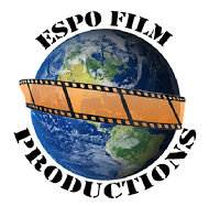
Logos As a collective, the team all decided to draw a logo each on a piece of paper. The logos were so contrasting that the collective could not decide on a specific logo that had been suggested by one of the members. In that case, it was taken upon the editor to combine all of the ideas into 3 different logos that could then be analysed and evaluated. The 3 different logos that have been shortlisted have been explained and critically analysed in order to form a justified result. Logo 1: One positive aspect of this logo was that it was easy to create and anything that was difficult to do, could be resolved by online help guides – all of the images/text could be inserted and edited simply. This is a positive aspect because it was not rushed and not a lot of time was spent creating it. This meant that more time could be focussed on filming/editing etc. Also, the logo also includes all of the relevant information needed in a logo. This is useful to other companies because t...


