Posts

Post 27 - Editing

Image
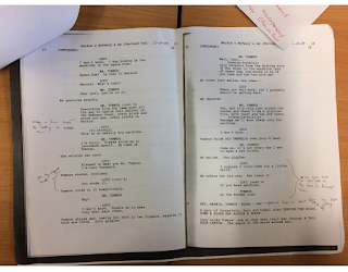
After reading the script it is clear that it uses linear narrative, which is when a scene or story has a defined start, middle and end with no cutaways from that order. This is the traditional way of telling stories as it is straightforward to understand, which is especially helpful in Narnia, as it is a children’s story. Linear narrative is used to great effect in this scene to build audience engagement in the world inside the wardrobe, as it allows them to take in the new surroundings at a good pace, in the scene there are a lot of long drawn out parts which help ease the viewer into taking in the new environment. This is often used in films, one example could be Star Wars, every time they visit a new planet there are usually slower paced conversations or shots of the environment to help the viewer adapt from environment to environment. A theoretical effect we could use within our video is the Kuleshov Effect. An example of a location within the script where we coul

Welcome

Image
welcome to my blog
Image
Justification Characters: Katie Caitlin Katie Billham and Caitlin Richards have been chosen to represent the two characters in the story because they have free periods when the group requires the two characters to film the project. They were also selcted because the strong female characters represent that a role of a man does not require a man to cast - vice versa for a female.The two characters were also post GCSE drama students and free when the filming process takes place. A large selection of background characters have also been included in this production. This is in the best interest of the audience so that the scene looks authentic and realistic.This would also set an appropriate atmosphere on the scene as the typical library is quiet, controlled and calm. Settings: Library Library (Angle A Library (Angle B) The library was chosen as a setting because it was an ideal filming setting. This is because it has a large amount of space, conevient to film d
Image
Logos As a collective, the team all decided to draw a logo each on a piece of paper. The logos were so contrasting that the collective could not decide on a specific logo that had been suggested by one of the members. In that case, it was taken upon the editor to combine all of the ideas into 3 different logos that could then be analysed and evaluated. The 3 different logos that have been shortlisted have been explained and critically analysed in order to form a justified result. Logo 1: One positive aspect of this logo was that it was easy to create and anything that was difficult to do, could be resolved by online help guides – all of the images/text could be inserted and edited simply. This is a positive aspect because it was  not rushed and not a lot of time was spent creating it. This meant that more time could be focussed on filming/editing etc. Also, the logo also includes all of the relevant information needed in a logo. This is useful to other companies because they